Postprocessing | ||
| ||
- Checking material directions
The material directions obtained from the orientation definition can be checked in the Visualization module.
To plot the material orientation:
First, change the view to a more convenient setting. If it is not visible, display the Views toolbar by selecting from the main menu bar. In the Views toolbar, select the X–Z setting.
From the main menu bar, select .
The orientations of the material directions for the circuit board at the end of the simulation are shown. The material directions are drawn in different colors. The material 1-direction is blue, the material 2-direction is yellow, and the 3-direction, if it is present, is red.
To view the initial material orientation, select . In the Step/Frame dialog box that appears, select Increment 0. Click .
Abaqus displays the initial material directions.
To restore the display to the results at the end of the analysis, select the last increment available in the Step/Frame dialog box; and click .
- Animation of results
You will create a time-history animation of the deformation to help you visualize the motion and deformation of the circuit board and foam packaging during impact.
To create a time-history animation:
Plot the deformed model shape at the end of the analysis.
From the main menu bar, select .
The animation of the deformed model shape begins.
From the main menu bar, select to turn off perspective.
In the context bar, click
 to pause the animation after a full cycle has been completed.
In the context bar, click
 and then select a node on the foam packaging near one of the corners that impacts the floor. When you restart the animation the camera will move with the selected node. If you zoom in on the node, it will remain in view throughout the animation.
Note:
To reset the camera to follow the global coordinate system, click
 in the context bar.
While you view the deformation history of the drop test, take note of when the foam is in contact with the floor. You should observe that the initial impact occurs over the first 4 ms of the analysis. A second impact occurs from about 8 ms to 15 ms. The deformed state of the foam and board at approximately 4 ms after impact is shown in Figure 1.
Figure 1. Deformed mesh at 4 ms.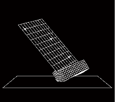
- Plotting model energy histories
Plot graphs of various energy variables versus time. Energy output can help you evaluate whether an Abaqus/Explicit simulation is predicting an appropriate response.
To plot energy histories:
In the Results Tree, click mouse button 3 on History Output for the output database named Circuit.odb. From the menu that appears, select Filter.
In the filter field, enter *ALL* to restrict the history output to just the energy output variables.
Select the ALLAE output variable, and save the data as Artificial Energy.
Select the ALLIE output variable, and save the data as Internal Energy.
Select the ALLKE output variable, and save the data as Kinetic Energy.
Select the ALLPD output variable, and save the data as Plastic Dissipation.
Select the ALLSE output variable, and save the data as Strain Energy.
In the Results Tree, expand the XYData container.
Select all five curves. Click mouse button 3, and select from the menu that appears to view the X–Y plot.
Next, you will customize the appearance of the plot; begin by changing the line styles of the curves.
Open the Curve Options dialog box.
In this dialog box, apply different line styles and thicknesses to each of the curves displayed in the viewport.
Next, reposition the legend so that it appears inside the plot.
Double-click the legend to open the Chart Legend Options dialog box.
In this dialog box, switch to the Area tabbed page, and toggle on Inset.
In the viewport, drag the legend over the plot.
Now change the format of the X-axis labels.
In the viewport, double-click the X-axis to access the X Axis options in the Axis Options dialog box.
In this dialog box, switch to the Axes tabbed page, and select the Engineering label format for the X-axis.
The energy histories appear as shown in Figure 2.
Figure 2. Energy results versus time.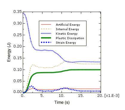
First, consider the kinetic energy history. At the beginning of the simulation the components are in free fall, and the kinetic energy is large. The initial impact deforms the foam packaging, thus reducing the kinetic energy. The components then bounce and rotate about the impacted corner until the opposite side of the foam packaging impacts the floor at about 8 ms, further reducing the kinetic energy.
The deformation of the foam packaging during impact causes a transfer of kinetic energy to internal energy in the foam packaging and the circuit board. From Figure 2 we can see that the internal energy increases as the kinetic energy decreases. In fact, the internal energy is composed of elastic energy and plastically dissipated energy, both of which are also plotted in Figure 2. Elastic energy rises to a peak and then falls as the elastic deformation recovers, but the plastically dissipated energy continues to rise as the foam is deformed permanently.
Another important energy output variable is the artificial energy, which is a substantial fraction (approximately 15%) of the internal energy in this analysis. By now you should know that the quality of the solution would improve if the artificial energy could be decreased to a smaller fraction of the total internal energy.
What causes high artificial strain energy in this problem?
Contact at a single node—such as the corner impact in this example—can cause hourglassing, especially in a coarse mesh. Two common strategies for reducing the artificial strain energy are to refine the mesh or to round the impacting corner. For the current exercise, however, we shall continue with the original mesh, realizing that improving the mesh would lead to an improved solution.
- Evaluating acceleration histories at the chips
The next result we wish to examine is the acceleration of the chips attached to the circuit board. Excessive accelerations during impact may damage the chips. Therefore, in order to assess the desirability of the foam packaging, we need to plot the acceleration histories of the three chips. Since we expect the accelerations to be greatest in the 3-direction, we will plot the variable A3.
To plot acceleration histories:
In the Results Tree, filter the History Output container according to *A3*; select the acceleration A3 of the nodes in sets TopChip, MidChip, and BotChip; and plot the three X–Y data objects.
The X–Y plot appears in the viewport. As before, customize the plot appearance to obtain a plot similar to Figure 3.
Figure 3. Acceleration of the three chips in the Z-direction.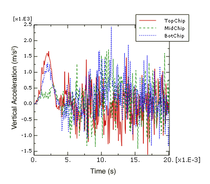
Next, we will evaluate the plausibility of the acceleration data recorded at the bottom chip. To do this, we will integrate the acceleration data to calculate the chip velocity and displacement and compare the results to the velocity and displacement data recorded directly by Abaqus/Explicit.
To integrate the bottom chip acceleration history:
In the Results Tree, filter the History Output container according to *BOTCHIP*, select the acceleration A3 of the node in set BotChip, and save the data as A3.
In the Results Tree, double-click XYData; then select in the Create XY Data dialog box. Click .
In the Operate on XY Data dialog box, integrate acceleration A3 to calculate velocity and subtract the initial velocity magnitude of 4.43 m/s. The expression at the top of the dialog box should appear as:
integrate ( "A3" ) - 4.43
Click to plot the calculated velocity curve.
In the Results Tree, click mouse button 3 on the velocity V3 history output for the node in set BotChip; and select from the menu that appears.
The X–Y plot appears in the viewport. As before, customize the plot appearance to obtain a plot similar to Figure 4. The velocity curve you produced by integrating the acceleration data may be different from the one pictured here. The reason for this will be discussed later.
Figure 4. Velocity of the bottom chip in the Z-direction.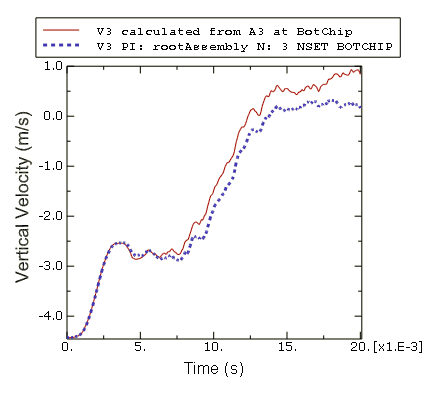
In the Operate on XY Data dialog box, integrate acceleration A3 a second time to calculate chip displacement. The expression at the top of the dialog box should appear as:
integrate ( integrate ( "A3" ) - 4.43 )
Click to plot the calculated displacement curve.
Notice that the Y-value type is length. In order to plot the calculated displacement with the same Y-axis as the displacement output recorded during the analysis, we must save the X–Y data and change the Y-value type to displacement.
Click to save the calculated displacement curve as U3-from-A3.
In the XYData container of the Results Tree, click mouse button 3 on U3-from-A3; and select from the menu that appears.
In the Edit XY Data dialog box, choose Displacement as the Y-value type.
In the Results Tree, double-click U3–from-A3 to recreate the calculated displacement plot with the displacement Y-value type.
In the Results Tree, click mouse button 3 on the displacement U3 history output for the node in set BotChip; and select from the menu that appears.
The X–Y plot appears in the viewport. As before, customize the plot appearance to obtain a plot similar to Figure 5. Again, the curve you produced by integrating the acceleration data may be different from the one pictured here. The reason for this will be discussed later.
Figure 5. Displacement of the bottom chip in the Z-direction.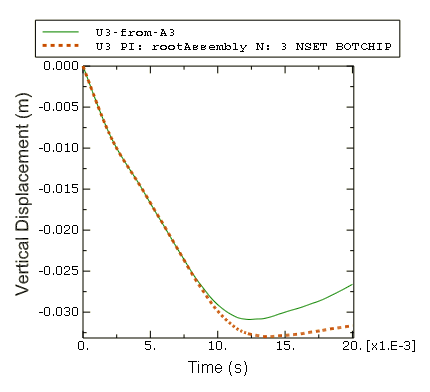
Why are the velocity and displacement curves calculated by integrating the acceleration data different from the velocity and displacement recorded during the analysis?
In this example the acceleration data has been corrupted by a phenomenon called aliasing. Aliasing is a form of data corruption that occurs when a signal (such as the results of an Abaqus analysis) is sampled at a series of discrete points in time, but not enough data points are saved in order to correctly describe the signal. The aliasing phenomenon can be addressed using digital signal processing (DSP) methods, a fundamental principle of which is the Nyquist Sampling Theorem (also known as the Shannon Sampling Theorem). The Sampling Theorem requires that a signal be sampled at a rate that is greater than twice the signal's highest frequency. Therefore, the maximum frequency content that can be described by a given sampling rate is half that rate (the Nyquist frequency). Sampling (storing) a signal with large-amplitude oscillations at frequencies greater than the Nyquist frequency of the sample rate may produce significantly distorted results due to aliasing. In this example the chip acceleration was sampled every 0.07 ms, which is a sampling rate of 14.3 kHz (the sample rate is the inverse of the sample size). The recorded data was aliased because the chip acceleration response has frequency content above 7.2 kHz (half the sample rate).
- Aliasing of a sine wave
To better understand how aliasing distorts data, consider a 1 kHz sine wave sampled using various sampling rates, as shown in Figure 6.
Figure 6. 1 kHz sine wave sampled at 1.1 kHz and 3 kHz.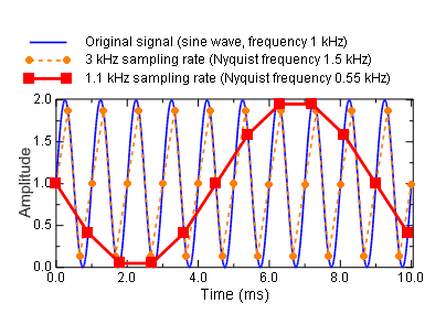
According to the Sampling Theorem, this signal must be sampled at a rate greater than 2 kHz to avoid alias distortions. We will evaluate what happens when the sample rate is greater than or less than this value.
Consider the data recorded with a sample rate of 1.1 kHz; this rate is less than the required 2 kHz rate. The resulting curve exhibits alias distortions because it is an extremely misleading representation of the original 1 kHz sine wave.
Now consider the data recorded with a sample rate of 3 kHz; this rate is greater than the required 2 kHz rate. The frequency content of the original signal is captured without aliasing. However, this sample rate is not high enough to guarantee that the peak values of the sampled signal are captured very accurately. To guarantee 95% accuracy of the recorded local peak values, the sampling rate must exceed the signal frequency by a factor of ten or more.
- Avoiding aliasing
In the previous two examples of aliasing (the aliased chip acceleration and the aliased sine wave), it would not have been obvious from the aliased data alone that aliasing had occurred. In addition, there is no way to uniquely reconstruct the original signal from the aliased data alone. Therefore, care should be taken to avoid aliasing your analysis results, particularly in situations when aliasing is most likely to occur.
Susceptibility to aliasing depends on a number of factors, including output rate, output variable, and model characteristics. Recall that signals with large-amplitude oscillations at frequencies greater than half the sampling rate (the Nyquist frequency) may be significantly distorted due to aliasing. The two output variables that are most likely to have large-amplitude high-frequency content are accelerations and reaction forces. Therefore, these variables are the most susceptible to aliasing. Displacements, on the other hand, are lower in frequency content by nature, so they are much less susceptible to aliasing. Other result variables, such as stress and strain, fall somewhere in between these two extremes. Any model characteristic that reduces the high-frequency response of the solution will decrease the analysis’s susceptibility to aliasing. For example, an elastically dominated impact problem would be even more susceptible to aliasing than this circuit board drop test which includes energy absorbing packaging.
The safest way to ensure that aliasing is not a problem in your results is to request output at every increment. When you do this, the output rate is determined by the stable time increment, which is based on the highest possible frequency response of the model. However, requesting output at every increment is often not practical because it would result in very large output files. In addition, output at every increment is usually much more data than you need; there is no need to capture high-frequency solution noise when what you are really interested in is the lower-frequency structural response. An alternative method for avoiding aliasing is to request output at a lower rate and use the Abaqus/Explicit real-time filtering capabilities to remove high-frequency content from the result before writing data to the output database file. This technique uses less disk space than requesting output every increment; however, it is up to you to ensure that your output rate and filter choices are appropriate (to avoid aliasing or other distortions related to digital signal processing).
Abaqus/Explicit offers filtering capabilities for both field and history data. Filtering of history data only is discussed here.