Available Approximation Graph Types | ||
| ||
Two-Dimensional Graphs
Two-dimensional graphs are created by evaluating the approximation at multiple points and show the behavior of the approximated output parameters with respect to the input parameters.
Two-dimensional graphs are color coded to show the feasibility and infeasibility of design points. Feasible design points are black, while infeasible design points are red. If the bounds are within the sampling range, input bounds are displayed. For more information on specifying these bounds, see Searching the Design Automatically Using Specified Criteria.
The following figure shows an example of a two-dimensional graph:
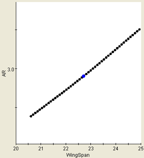
![]()
Three-Dimensional Graphs
Three-dimensional graphs show a three-dimensional view of the surface that shows the values of the output parameter depending on the values of any two input parameters. All input parameters except the selected two on the graph are held constant at their current values.
The following figure shows an example of a three-dimensional graph:
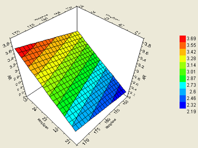
![]()
Contour Graphs
Contour Graphs show the various levels of the selected output parameter with respect to the two selected input parameters. Contour Graphs are in essence a three-dimensional surface plot viewed from above and are similar to a map with colored elevation levels.
The following figure shows an example of a contour graph:
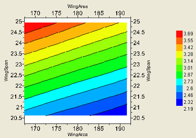
![]()
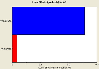
Local Effects Graphs
When Local Effects graphs are created, a DOE study is performed using the Latin Hypercube technique. The effects are calculated from regression results. The DOE is performed within a local region of the approximation (+/-10% of the total range centered around the current selected point). The number of points used is full quadratic, and (n+1) (n+2), where n is the number of inputs. The Local Effects graphs are updated (a new DOE study executed) only when a new design point is selected.
The following figure shows an example of a Local Effects graph:
![]()
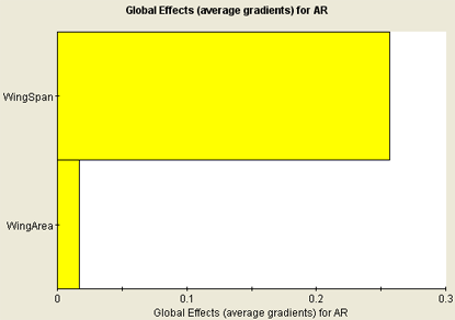
Global Effects Graphs
To create Global Effects graphs, a series of local DOE studies is executed at multiple points throughout the entire sampling region of the approximation model. The absolute values of local effects are then averaged over all the locations where local DOE studies were performed and displayed on the Global Effects graphs.
The following figure shows an example of a Global Effects graph: