Available Error Analysis Graphs | ||
| ||
Response Fit Graphs
Response fit plots show actual versus predicted response values for each response. The diagonal line in the plot represents a perfect fit (predicted = actual). If all points fall on or close to the diagonal line, the approximation model predicts well based on the error points. If the plot background is colored red, the response error is unacceptable based on the defined acceptance level.
The blue horizontal line shows the mean response value determined using the actual error sample data.
The following figure shows an example of a response fit graph:

![]()
Residual Graphs
Residual plots present the difference between the actual and predicted values for all error sample points for each response. The horizontal blue line at 0 represents 0 residual or 0 prediction error (predicted = actual). These plots can be used to identify outliers (points significantly further from the blue 0 residual line) or trends in the residuals (ideally residuals should be random, not increasing or decreasing or following a discernible shape with increasing response values).
The following figure shows an example of a residual graph:

![]()
Residual Frequency Graphs
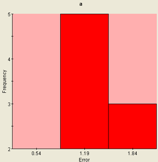
Residual frequency plots present the residuals (the difference between the actual and predicted values for all error sample points for each response) as a frequency of occurrence, from 0 to the maximum residual. These plots allow the distribution of the residuals to be reviewed (are more of the residuals close to 0 or closer to the maximum residual, constant across the range of residuals or is there a peak, etc.).
The following figure shows an example of a residual frequency graph:

![]()
Total Error Charts
Total error bar charts show the total error for all responses in the form of a bar chart. The number of charts displayed is based on your component settings. The data in the top graph are the same as the data presented numerically in the response table on the left side of the subtab. The second bar chart displays the standard deviation of the errors (standard deviation of the differences between the actual and predicted values) for all error sample points. This plot gives an indication of the spread of the error across the sample range for each response.
The following figure shows examples of total error bar charts:
